Sunday, October 30, 2011

The Space Between


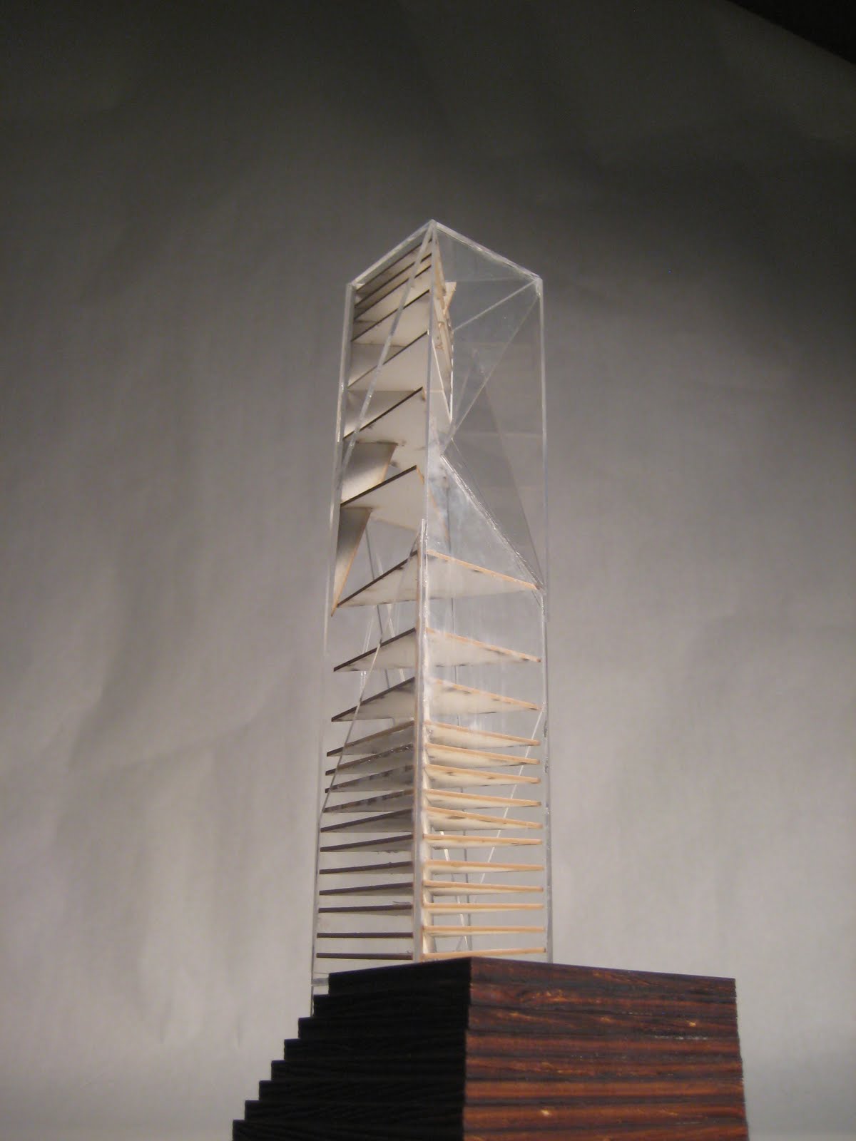
My structure focuses on the negative space it creates, hence its title.

Wednesday, October 19, 2011

How It All Came To Be


What now stands as a collection of 20 spectacular and variant structures, share a common beginning: a pile of metal “widgets.” Looking at the final models that currently decorate the desks in our studio, it is hard to fathom that we were all given the same assortment of odd metal parts to draw. We were told we could only use hard lines when drawing the widgets at a 1:4 scale. Although there seems to be little room for improvisation and the hand of creativity, each set of drawings that was presented at the end of the two week period was astonishingly different. The fact that we had all perceived beauty so differently in the arches, lines, and planes of the rusted metal parts was beautiful and poetic in itself. From the intricate and symmetrical notches on the clock cog to the delicate (and sinfully difficult to recreate) curves of the metal pin, there was a unique geometry to each widget which truly came forth in the third step of the process: creating Photoshop compositions with the widgets.
As we tinkered with our drawings on Photoshop many of us found that the drawings would oftentimes fit together seamlessly like corresponding pieces of a puzzle. However, when the drawings were forced, the compositions risked looking like “someone threw tools up into the air and let them land spontaneously on the page” (Pritchett, C.).
Just like the widget drawings evolved over the two weeks we worked on them, the compositions worked in a similar way. The first composition for many of us was not our best work (me including) but as the shapes and patterns became more obvious to us, the compositions took on a new life, and new forms.
These very compositions were then extruded into rough study models, and through the same process of evolution and discovery have become the final models that now decorate this blog page.

Widgets


Sunday, September 19, 2010

The intent of this model was for each cube to have the number of overhangs correspond to the number of scores in each module of skin. Therefore the structure would pierce through the skin, and literally tie into the structure.


For the base of the model, the question is asked, "How does the vertical meet the horizontal?" Due to my design being potentially top heavy, i extended the frame 4 modules below the surfaces, and brought down the overhangs to serve as anchors for the structure, creating unity in the structure both above and below.


Top view, each cubic module has a 90 degree overhang, which I used to tie in some of the structure.


Final structural model, we were to have translucent skin to show the relationship between both the structure(frame) and the skin(form). Although this model is an improvement from my 1st attempt I have still not fully grasp the unity between the two. More work to be done.

Sketches, renderings, drawings, and journal pages on the way.


Vertical Field


Yield. By definition means to give way to force or pressure so as to move, bend or collapse. Throughout the design of a vertical field this was the driving force behind the skin and framework that make it up. Since the skin was designed first, my intentions were to keep the spaces created uninterrupted and therefore have the framework "yield" to skin. This is still a design in progress, I am having trouble figuring out a fully functional framework that supports the skin. Drawings to come soon.
5 iterations of moving the modules throughout the field.
First attempt at a structural model. The structure did not have any relationship to the skin, final structural model soon to come.

Final skin model. As you can see the open spaces and scoring have an inverse relationship which change as you move up or down the vertical field.


We were assigned a Vertical Field Project as our first study for our 3rd year in architecture. We were to create a vertical field, starting with a 2''x 2''x 10'' skin. This project was first only about skin, and modules. We were to make 5 iterations of different modular designs moving across the skin of the field, and were to assign a verb describing our skin. After, we created the framework incorporated with our skin.
Anyways, I really liked a quote in the book Delirious New York which was,
"Brute material has been robbed of its density and flung into the sky to challenge its loveliness."
With this in mind, I wanted my vertical field to appear very dense at the top, and light on the bottom.
I moved the skin around creating 4 cubes growing in size as elevation increased. I then cut and scored the skin of the structure accordingly, making the skin more solid and dense as it rose, and very open and translucent near the bottom.


Friday, September 17, 2010

A Room and a Garden


This semester in Patrick Down's 3rd year studio, we are designing a room and a garden located at the RDF. We started the first week of studio with intense design charrette. Our rooms must be fully enclosed and be a maximum of 400 sqft.


Here is 1/2" = 1' study model I built. We were instructed to build it in section so that we could work with the interior and focus on how the building meets the landscape. A challenge we were faced with involved noticing the details of walls, floors, ceilings, and roofs.


The main idea behind my room is directionality. The grade slopes at 2% towards the north. I wanted the entry of my room to be on the South side and as you enter the room, your focus is towards the North. My garden will be located on the north side of the room. Having a large glass window on the north side allows for a great framed view of the landscape and garden, while the room shields this window from direct sunlight.


I am planning on using a two layers of entry doors, one glass and one solid, to allow for flexibility in how much direct light is let in from the south side.

More drawings, models, and details to come!

Tuesday, September 7, 2010

Vertical Field Extension

This is the extension of our Vertical field assignment. We had to create a skin for our structure based on a verb and then create a structure based on the verb as well. This is the next step. Pictures to come soon.

Friday, May 28, 2010

Thursday, May 13, 2010

Concrete Printing


These are my two concrete prints. The first one was a thicker pour and less detail came out, and the form of the slab was a little rough. The second pour had a better consistency and the form was much better. More detail came out, but it clouded the image of the airplane. That might just be an issue with the image and the contrast. I'm very pleased I was able to get two attempts cranked out before the end of the semester. Hopefully once Chris is back in a year we can do a lot more concrete printing!

Tuesday, May 4, 2010

Timber Render


As a part of formulating my portfolio from this year, I wanted to apply my knowledge that I had learned this semester in Patrick Clay's Rhino class to my studio work, so I used V-Ray to render how my timber framing roof would look at sunset. I found that V-Ray can be a powerful tool in the final presentation of a project, and intend on rendering some of my past projects over this summer as a part of documenting my work.

Saltmaker's House

This is my proposal for the saltmaker's house we did at the beginning of the spring semester. I had originally hand drawn the plans for our presentation, but decided during the last two weeks of school to put them into my computer so i would have a digital version of my work. The plans are drawn up in AutoCAD and are posted as JPEG images below.