Friday, April 30, 2010

Salt Maker
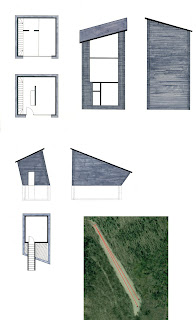
These are the redone drawings that I did for my Salt Maker house. In contrast to my earlier drawings, I feel these do a much better job of conveying what I really wanted to express in my design. I alloted more detail to the facade, which provides a better understanding of the materials used and what they add to the house and the workshop. In addition I added color, which provides a better understanding of the structure of the house as well as add additional elements of detail to the facade. Lastly I added a more lucid map of the layout of the two buildings, which provides more insight as to where and why each building sits where it does.
Timber Frame
The purpose of the project was to ultimately challenge the notion of up and down within the timber frame structures. To do this I took the most literal approach and created two separate planes. One horizontal, spanning across the four columns and designed to appear solid yet allowing light to penetrate through a create an interesting shadow effect. This horizontal plane was broken by two connected beams, which cut through the plane on an angle, and as with the horizontal plane, oriented toward the middle of Burchard Plaza.

Thursday, April 29, 2010

The Butterfly Effect


The Butterfly Effect represents chaos within a system. It encapsulates the concept of sensitive dependence on initial conditions. Small differences of a dynamical system may produce large variations in the behavior of the system. The idea: although a butterfly flapping its wings has remained constant in the expression, the location of the butterfly, the consequences and the location of the consequences may vary widely. The concept relates to the timber-framed system because each beam is dependent on another to remain sustained and a slight change in the joinery of the beam effects the system as a whole.

Art of Building


Building: The Mode Gakuen Cocoon Tower
Architects: Tange Associates


Saltmaker

when i started this project, i was designing these bizarre, sculptural forms. they began as white-washed mound-like buildings protruding from the ground, my only thought being "why don't i make the saltmaker's work, his home. and make it look like a salt mound!." i realized that my design was a bit contrived and completely unlivable. so it was scratched and i took another look at the program.
i had to design for the client, not me and my crazy imagination. so the floorplan became open so the saltmaker's dog can have freedom throughout the whole house while skylights and half-walls couls allow light reach all corners of the space, which is necessary in such a low-lit valley location. The design also allowed a separate yet connected workspace for the rest of the home. The client was very interested in eco-friendly design so geo-thermal floor heating and straw insulation were to be built into the structure.

Tuesday, April 27, 2010

Illustrations and Views of Salt Maker House

Illustrations.


Site.


North.

East.


South.
West.

Monday, April 26, 2010

Salt Maker House


Concrete. The one word that was the driving force for my Salt Maker's house. The idea is a house whose structure, interior and exterior space, and beauty is determined by concrete's ability to extrude from the surface and create the space to be occupied.

Saturday, April 24, 2010

Frames of Timber


When designing my timber frame roof, in trying to create a roof that would challenge the notion of traditional timber framing as well as the challenging the notion of 'up and down', I decided to also challenge the the concept of what a roof is. I began with one of the definitions of the word roof that I found in a dictionary: the highest point or limit; the summit. I took this as inspiration, and created four 'caps' for each of the four columns, rather than creating a traditional roof that would span the four columns. Each cap is constructed to hold three frames that frame particular views in the plaza, and in the sky, as the overall concept of this project for me, was to create something that would enhance the experience of this area in Burchard Plaza, in this case being something that would encourage viewers to look and hopefully observe surroundings that they have been missing. A few photographs of my model are pictured here, as well as my competition board done in pen.

Tuesday, April 20, 2010

Timber Competition Board

I decided to draft my competition board for the timber frame project, trying to improve my drawing abilities. I wanted to show something that my model could not, so I did an exploded axonometric drawing, attempting to show how the pieces were put in place. I included a short narrative to explain what the project meant to me.

Transparent Knowledge


In an exploration of "Soft Space" during the first semester, I envisioned a space that would not only allow people to connect with people, but also with everything that they need to in the world. There is a screen that you can interact with, simultaneously accessing every aspect of your life while allowing people to interact with you as each paned is made from a transparent material. The screens could also be linked together in a fashion to display a movie across multiple screens or they could all be linked together for a light show or for special announcements and/ or advertising. I this way, every person could interact with the structure as they needed to and could have a personal experience or share it with others. In the model for this structure, i tried to recreate what the experience would look like if there were to be an exhibition about famous buildings in architecture. The plexiglass pylons display their images and also behave differently in different lights.

Timber Chaos


This is my timber frame roof for the studio design competition held this past week. My model is made of bass wood, sprayed all white. My intention for the this roof was to create something asymmetrical that represented chaos. I photo shopped these images last night and had some fun with a few. Hope you enjoy.

Monday, April 19, 2010

Salt Maker

This is a section and floor plan from my salt maker house. It is done in all pencil, with graphite shavings for the background. The section focuses on showing on how light enters and affects each room. The top right room is a place to store the extra salt, and when the salt maker is ready to use the salt, all he will have to do is open the tube that goes from the storage room into the room below, the work room. To maximize space in this 600 sq. foot house, I placed a bookshelf for him to keep books and other collectibles underneath the staircase, which would have otherwise been wasted space.